
Choose a Table Colour Group from Everyday Pieces
Compare a small table colour group through the dishes and textiles you already use, keeping visual preference separate from the actual meal’s working space.
Shopping disclosure: links within this story are ordinary retailer links. Separately identified advertisements elsewhere on the page may contain affiliate links. Our full disclosure.
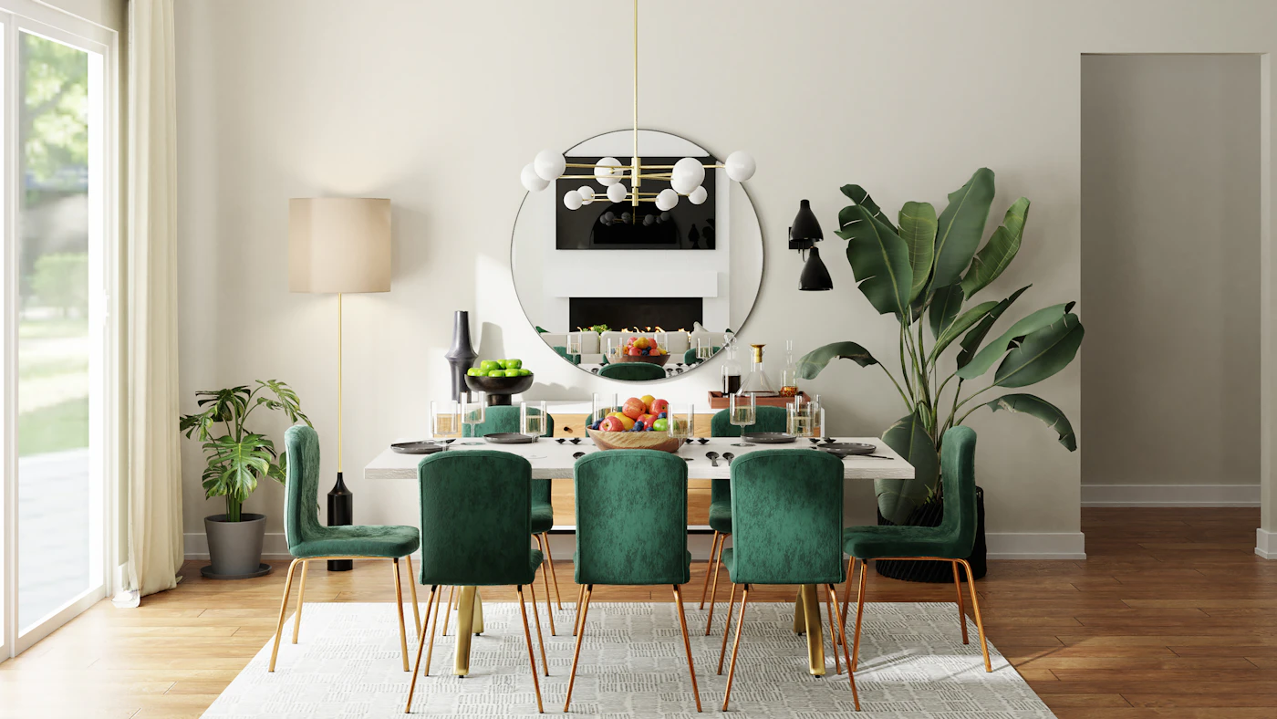
A table colour group can begin with the dishes, textiles and chairs already in everyday use. Compare them together before adding a decorative purchase. You may want a quiet relationship, a small contrast or a repeated colour that makes the group feel connected. The useful choice is personal and practical: a table you enjoy looking at that still supports the actual meal and the people sitting there.
Look at the permanent colours first
Notice the table surface, the chairs and nearby room elements. They are already part of the view even when the place settings are removed. A green chair or dark tabletop may contribute more to the group than a small napkin detail.
Describe what you actually see rather than beginning with a named theme. A quiet room can support a noticeable textile, while another setting may already contain several strong colours. There is no requirement to make every visible object participate in one exact match.
Build one place setting from existing pieces
Use a plate, glass and appropriate textile you genuinely intend to use. Compare the broad shapes and colours in the actual room. A pale plate may stand out against a darker surface, or similar tones may create a quieter group. Keep the preference separate from the pieces' actual composition and care requirements.
Try one alternative rather than laying out the whole cupboard. Changing the napkin while leaving the plate and surface constant can make the difference easier to read. Adding several new colours at once may obscure which relationship you preferred.
Repeat only what helps the whole table
Extend the chosen setting through the actual people and meal. Similar pieces can give the table a clear connection without requiring an identical set. A variation may be enjoyable when it has an understood role rather than appearing because the rest of the plan is unresolved.
The relaxed linen-table guide considers the everyday meal around the objects. Keep the colour decision within that real use, including the space needed for serving and ordinary movement.
Add decoration last, if it belongs
Look at the table before placing an extra object in the middle. A small repeated colour may already be present in the dishes or room. Another decoration should contribute something you actually want, not fill an assumed obligation to make the table look finished.
Follow the appropriate use and care of any objects involved, keeping the meal's requirements clear. A styled image does not establish that every item shown belongs beside the actual food or fits the table you use.
The sideboard serving-purpose guide helps when a separate surface has a real role. Moving an object there should clarify the arrangement rather than hide a crowded table in another part of the room.
Finish by viewing the group from the seats people will occupy. Keep the version you enjoy and remove an addition that does not help. A small colour plan has done enough when it makes existing everyday pieces feel deliberate while leaving the meal, conversation and ordinary care easier rather than more complicated.
A little more to adore
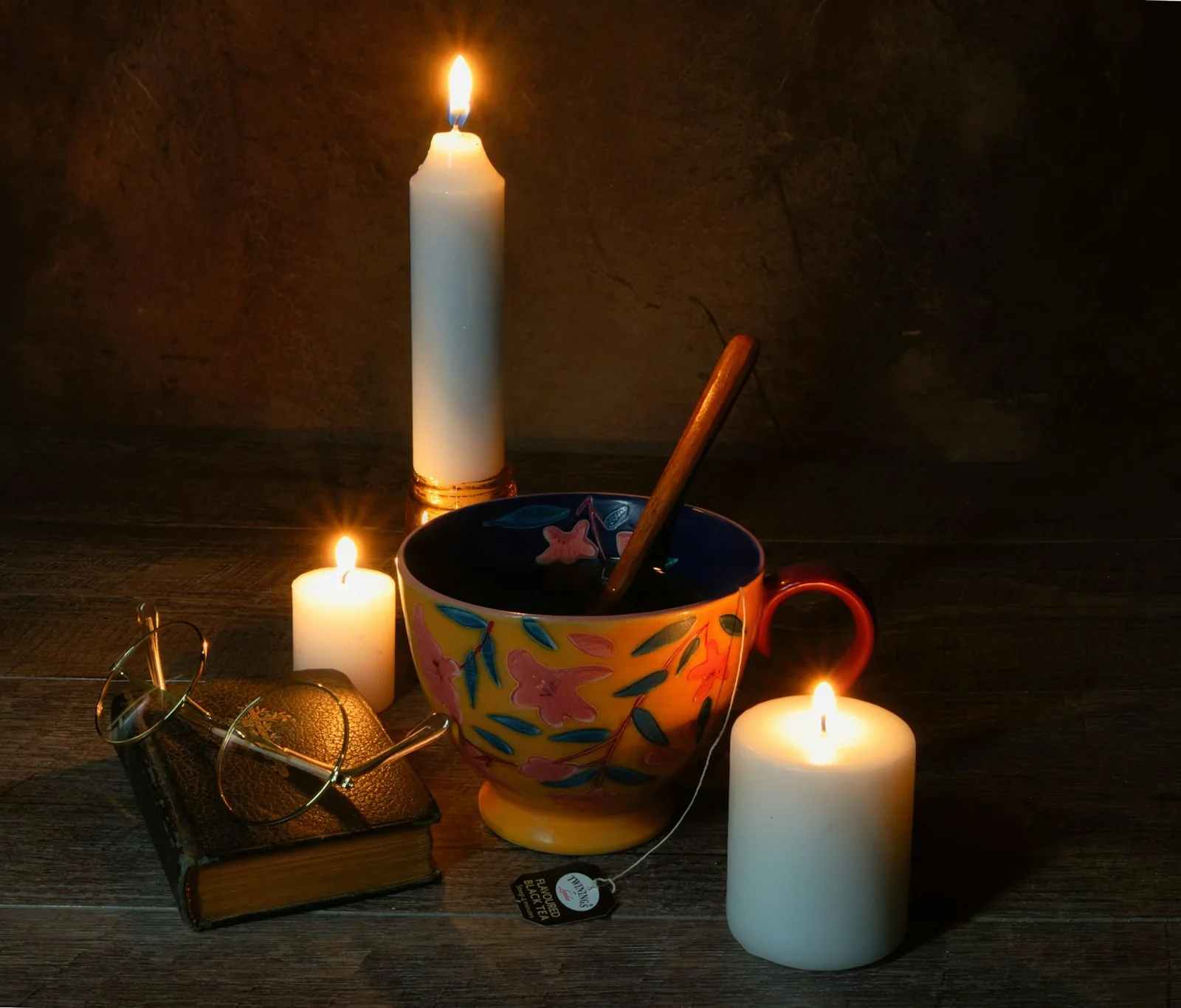
Give Bedside Glasses a Suitable Case and a Clear Place
Give bedside glasses an appropriate case, specific care, stable clear placement, comfortable access, separate belongings, and a complete morning handover.
Read the story →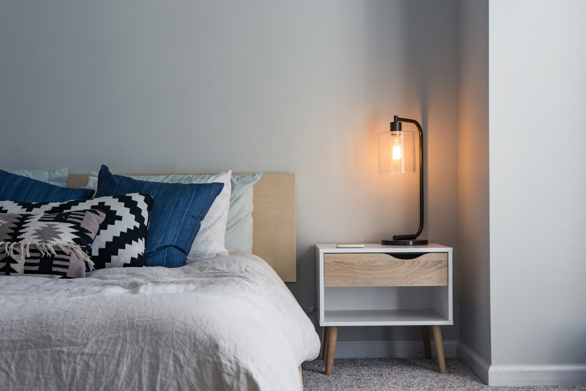
Choose a Bedside Lamp Through Switch Reach
A bedside lamp is easier to choose when its switch can be reached through the way the bed is actually used. A photograph of a lamp on a table says little about that ordinary m
Read the story →