
Compare a Print’s Colours with the Room You Already Have
Compare the colours in a prospective print with the room’s existing surfaces, keeping the image’s own appeal distinct from an exact decorative matching exercise.
Shopping disclosure: links within this story are ordinary retailer links. Separately identified advertisements elsewhere on the page may contain affiliate links. Our full disclosure.
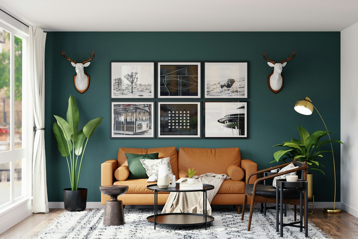
A print can belong in a room without repeating its existing colours exactly. Compare the image with the actual surfaces around it, while keeping your interest in the picture separate from the desire to complete a decorative palette. The useful choice is an image you want to live with in a place that suits it, not a purchase whose only purpose is to match a cushion.
Look at the print as an image first
Ask what you enjoy about the subject, shapes or composition before considering the room. If the image leaves you indifferent on its own, an exact colour match may not give it lasting interest. Equally, a print you care about may deserve a different position rather than being rejected because one colour differs from the sofa.
Identify the dominant areas and smaller accents. A small bright mark may draw more attention than a large quiet background. Notice the relationship rather than listing every colour you can find. This helps you compare the image at the scale and distance at which you expect to view it.
Compare with the real room
Look at the wall, nearby furniture and materials in the light normally available. Screen images and product photographs may show colours differently, so avoid treating a digital comparison as a precise match. Where a suitable physical sample or actual print is available, use it appropriately and understand what it represents.
Consider the colours immediately around the proposed position before scanning the entire home for a matching detail. A dark wall can change how a pale border appears, while a busy shelf may compete with a detailed image. You do not need every room object to refer to the same palette.
Test a relationship rather than a formula
You might prefer a print that repeats a quiet existing colour, introduces a small contrast or adds a different temperature to the group. Describe the effect in your own words and compare one alternative at a time. Formal rules about complementary colours are unnecessary for deciding whether you like the actual result.
The cushion care guide is a useful reminder that changing the textiles to accommodate a print creates its own practical decision. Avoid expanding one image purchase into an automatic replacement of objects that already work.
Keep the display decision separate
Confirm the image's dimensions, orientation and any framing requirements through the actual product information. Use appropriate guidance for installation and care rather than improvising a technical solution through a styling exercise. A paper outline can help you imagine size without requiring you to place an object unsafely against the wall.
If the print is a gift, the frame-and-recipient choice guide helps preserve the recipient's control over display. Your preferred colour relationship does not establish someone else's room arrangement.
Finish with two clear answers: you want the image, and the intended position lets you enjoy it. The colours may connect closely or remain deliberately distinct. Either can work as a personal choice when the print and the room have been considered together rather than reduced to a matching exercise.
A little more to adore

Give Bedside Glasses a Suitable Case and a Clear Place
Give bedside glasses an appropriate case, specific care, stable clear placement, comfortable access, separate belongings, and a complete morning handover.
Read the story →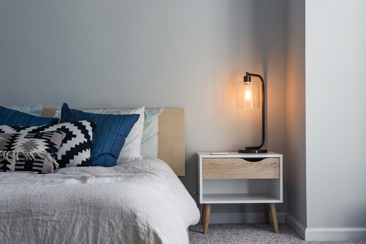
Choose a Bedside Lamp Through Switch Reach
A bedside lamp is easier to choose when its switch can be reached through the way the bed is actually used. A photograph of a lamp on a table says little about that ordinary m
Read the story →